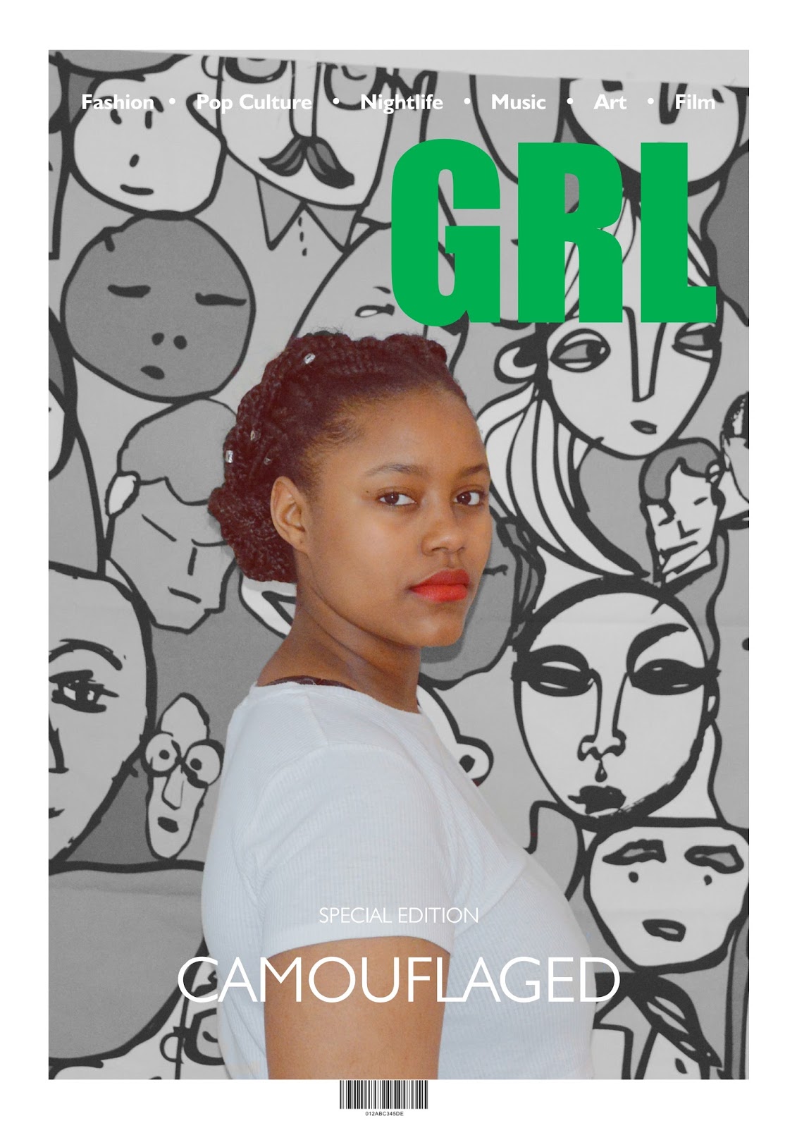
Music Magazine Front Cover : Edit 10
Creative and Design Decisions: Edit 3
The reason I chose to edit my image in this way on this edit
of my music magazine is because I wanted the image to stand out and I wanted it
to be the main subject of the image.
I used Photoshop to change the image the filter from black
and white all over to just in the background, leaving the main subject with a
natural filter.
In terms of the title and the change of the of colour of the
font I chose to make it green considering red and green are complimentary colours
making them clash and stand out together.


Comments
Post a Comment