Case Study: Cover Analysis
TIME Magazine
Image
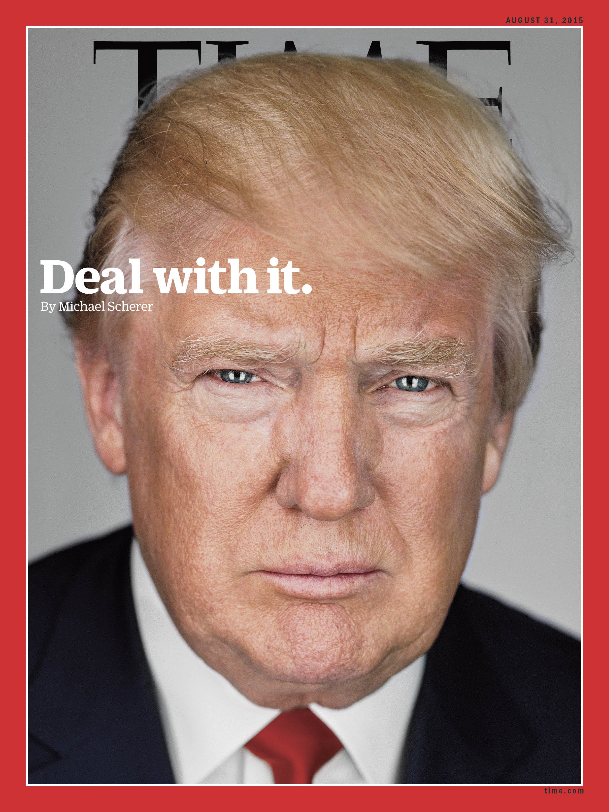
This cover
is a picture of Donald Trump. He appears on the centre front of the magazine
covering the name of the Magazine. He uses up most of the Cover as he is
staring straight at the camera and just his face is shown.
Cover lines
On this
Magazine there is only one headline that is positioned on the top left hand
corner near the models forehead. The headline stands out as it is in white. It
does not take up much of the space on the cover but does draw a lot of
attention.
Main Cover line
The main
cover line is the only cover line on this Magazine cover. Which is positioned
on the top left hand corner of the page. It does not take up most of the page
but it does definitely draw a lot of attention as it is in white and disturbs
the picture.
Title
The title
of the magazine sits at the top of the magazine and is covered by the head of
the model therefore it does not occupy much space.
Taglines
This
magazine actually does not have a tagline
Price
This
magazine does not have a price on the cover.
Date
This cover
has a date on the top right corner hidden and hardly noticeable.
Seventeen Magazine
This cover
is a picture of Jenifer Lawrence. The picture is positioned in the middle of
the magazine but slightly more to the right than the centre. It occupies most
of the cover.
Cover Lines
On this
magazine there are several cover lines which help fill up the space around the
models face. It even overlaps the models face at times. It uses up a lot of space and stands out a
lot.
Main Cover Lines
The main
cover line is located at the bottom right of the cover. It occupies very little
space but does stand out as it is printed in a large and colourful font.
Titles
The title
sits behind the model but can still be seen. It does not occupy much space but
can still be clearly.
Taglines
The tagline
is positioned on the right side of the models face. It does not occupy much
space is quite hard to identify.
Price
This
Magazine has a price. It is located at the bottom left corner and does not
occupy much space.
Date
This cover
does have a date on it next to the price and on top of the barcode. It does not
occupy much space.
Vogue Magazine
Image
This cover
is a picture of Lena Dunham. The picture is just of her from mid chest upward.
It is positioned in the middle of the page staring straight at the camera.
Cover Lines
On this
Magazine there are many headlines located in every free space on the cover. The
headlines help cover most of the magazine. This draws attention away from the
models face.
Main Cover Lines
The main
cover line on this magazine is positioned at the bottom centre of the cover. It
takes up most of the space at the bottom and does stand out quite a bit as it is
printed in a bold black colour.
Title
The title
of this magazine is located at the top of the magazine where it stands in front
of the model in bright red. It occupies quite some space on the models head.
Taglines
This
magazine has a tagline on the upper left side of the cover. It does not take up
much of the page.
Price
This
magazine does not have a price on it.
Date
This
magazine does have a date underneath the title in very small white letters it
is barely noticeable.


Comments
Post a Comment